Nalu Surf forecast web app
Overview
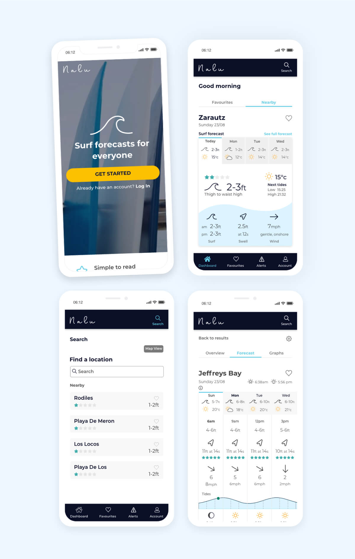
Nalu is a beautiful and simple to understand wind, wave and weather surf forecast, designed for surfers of all experience levels.
You can read the full version of this project by clicking here .
My process
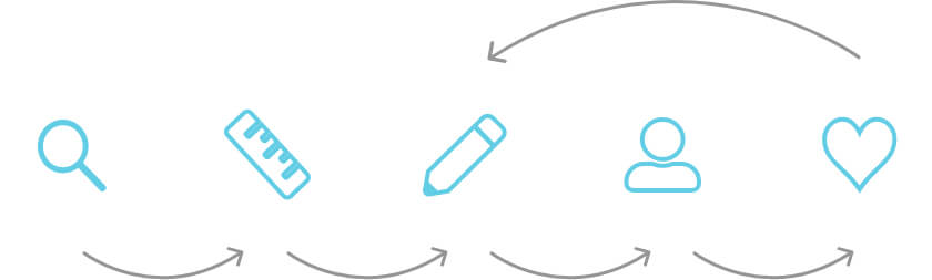
My design process was to: Research, Define, Design, Testing and Refine.
Tools used: Adobe XD, Optimal Sort
Client: CareerFoundry project
Role: UX & UI Designer

Research
The brief was to design a beautifully displayed and easy to understand web app which can help to alleviate some of the stress and confusion when checking if conditions are safe to surf at sea. I designed the UX and UI for the website over the duration of a year whilst working full time.
We believe that creating an app with clear and appealing graphics will help users plan their surf session and stay safe at sea. Beginner to advanced surfers will be able to quickly search and understand our forecasts using the simple and intuitive interface design.
Ideation
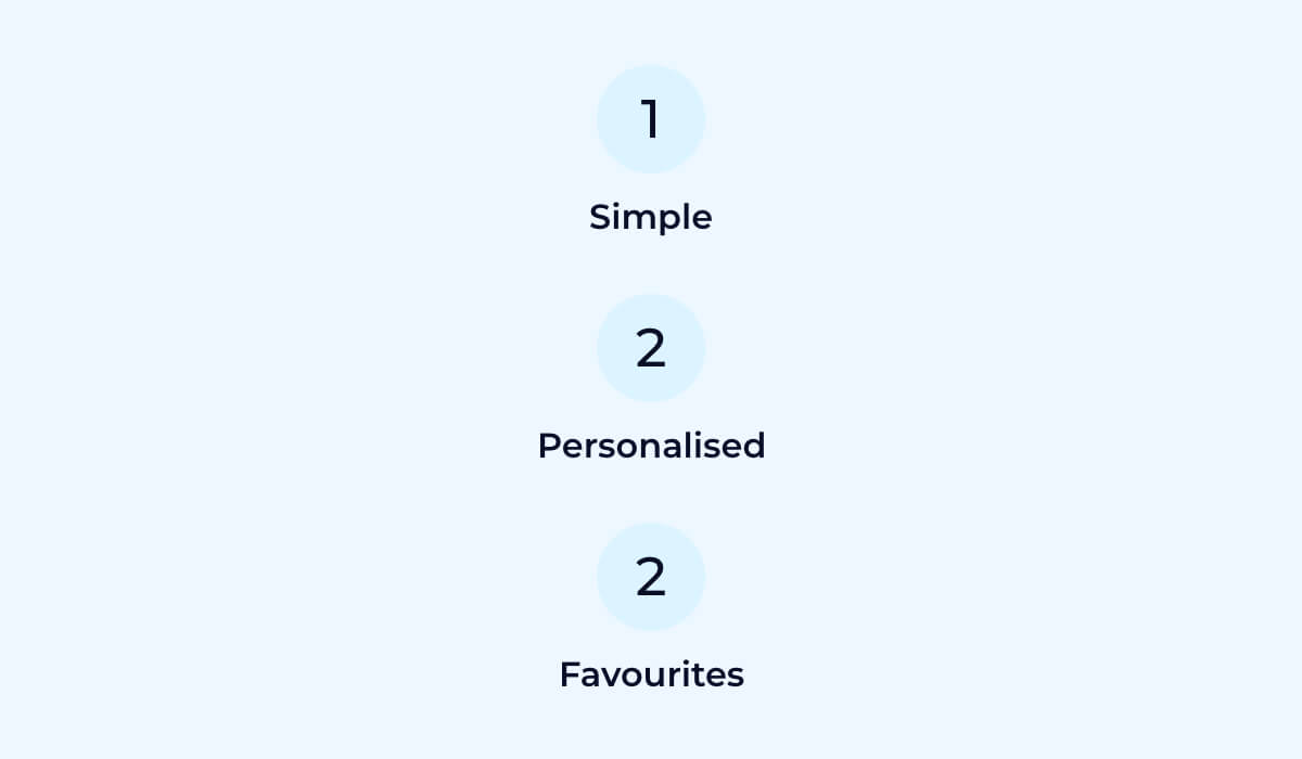
We created three goals to meet our target users key needs based on the findings from our competitor analyis and user interviews. We will design simple and easy to understand forecasts, personalised search results based on users set preferences and a feature for users to save and check the forecasts of their favourite surf spots.
Wireframes
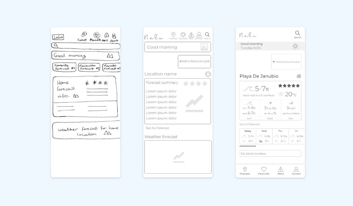
We sketched ideas using our sitemap and user flow to guide navigation decisions. Several iterations were made before selecting our strongest designs to develop into wireframes.
We made several iterations from low to high fidelity wireframes, starting with the dashbaord. Between design iterations, we learnt what forecast information is essential for our target users. We designed a simple and condensed forecast which users could easily check to decide whether or not to surf today.
Then we made changes to the surf spot page. Initially we designed this page to only show forecast information, from user research we learnt that our target users enjoy seeing information about the location, nearby spots and if it is suitable for their experience level.
Design
We made iterations to our prototype based on the most critical errors found from our test results.
All of our test participants were unsure how to return to their dashboard and none of them used the forecasts button. We decided to replace the forecasts button with dashboard as it is where most users would expect to find a home button.
100% of users tested felt uncertain that their selected spot had been saved so we decided to add notifications for confirmation. They appear on screen for a few seconds to grab the users attention.
Prototype
We made several iterations based on our user test results and to refine the design. You can try using the responsive app for yourself.
Conclusion
The final prototype designed for Nalu is beautiful and simple to read. I would like to test the iterations made to see how sucessful they are and to further refine the apps design.
To see the full version of this project click here .